Williams-Sonoma
Thanksgiving
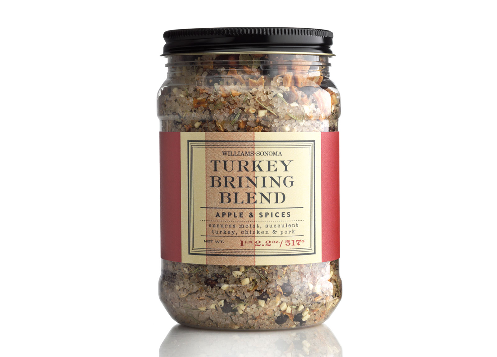
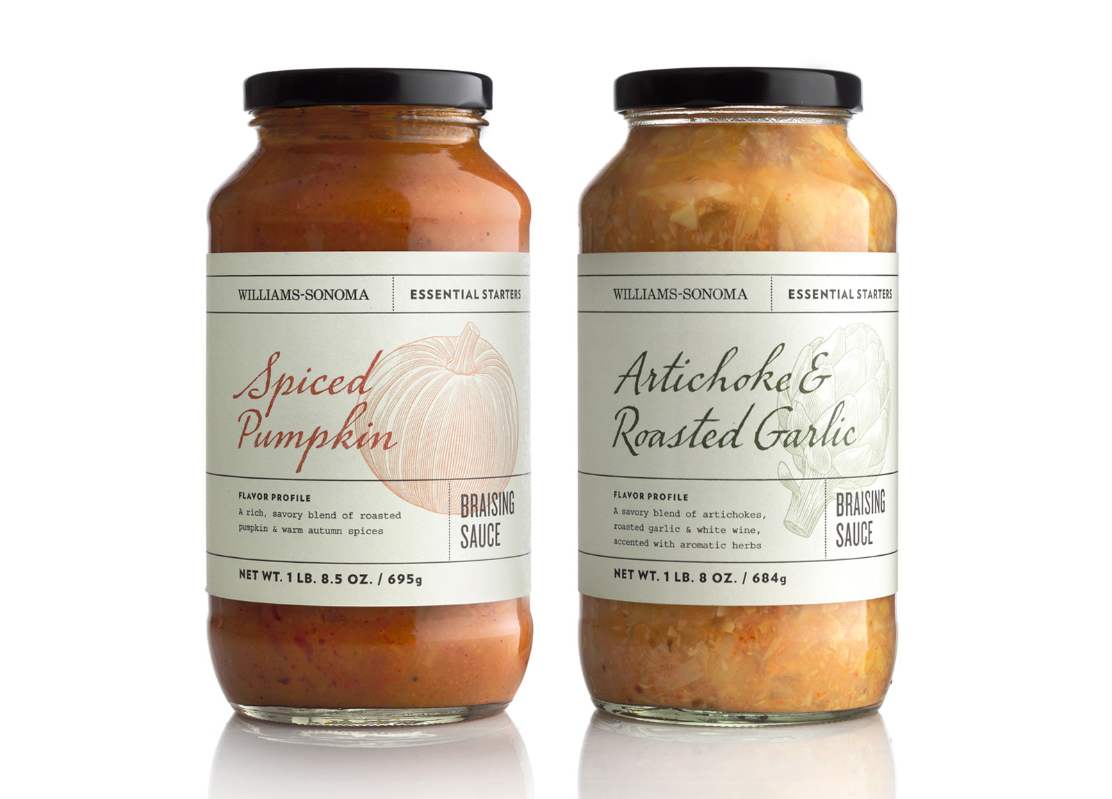
At Thanksgiving, the warm and welcoming seasonal packaging system is a key ingredient to Williams-Sonoma’s potential profits. When it was time to move the brand forward and update the system’s aesthetic, the challenge was to retain core customers by preserving Williams-Sonoma’s classic look while executing a fresh and modern facelift. The result: A clean system featuring sophisticated typographic treatments and traditional uses of color and illustrations, taking cues from wine packaging of Sonoma, California, and paying homage to the brand’s historic roots. (Credits: Cult Partners)
Project Scope
Packaging Design