Whole Earth
Sweetener Co.
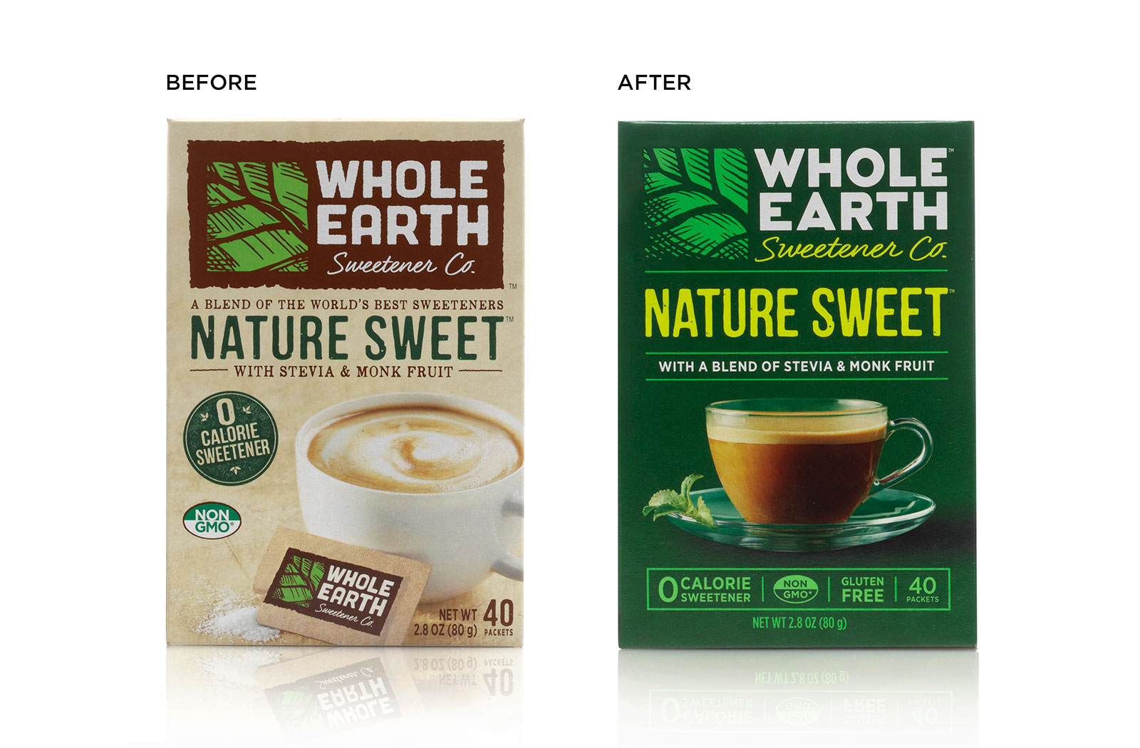
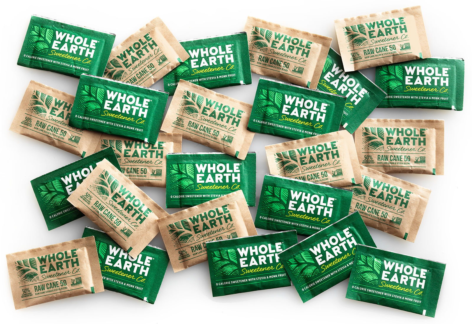
The challenge was to update the look of this low calorie, natural sweetener so that it would appeal to a millennial shopper, while assuring loyal customers that the quality they trust hasn’t changed. Pavement felt the cherished notion that neutral color palettes reflect a “natural” product was outdated – so they helped Whole Earth stand out from the crowd with vibrant green and fluorescent yellow packaging, reflecting a bright, fresh flavor. The logo was updated to a cleaner style while still retaining customer recognition and all of the product call-outs were better organized into a single box for easier reference. The product photography was then updated to give the product context a more contemporary feel. In the end, the product remains recognizable to Whole Earth fans, while also becoming a fresh new face in the marketplace.
Project Scope
Packaging DesignIdentity Design
Product Rebranding